Showing posts with label Visual Communication. Show all posts

Tuesday, 4 March 2014

Scent Trends Lecture

Lecture Summary:

Today's lecture with Tim discussed messages themes and trends within perfume, fragrance and scents. He broke the industry down into 4 generalised sectors, in which all perfume (theoretically) can be labelled and categorised. He then discussed the personalities and visual codes used within each of these areas.

Lecture Notes:

Sensuality and Indulgence:

    • Forbidden/Seductive/Exotic/Passionate
    • Colours are often rich and include golds, reds and purples
Examples could include:


Trust and Honesty:
    • Purist/Spiritual/Simple/Natural
    • Colours are often pale and calming and include blues, greens and white
Examples could include:


Humour and Kitsch:
    • Camp/Wit/Ironic/Modern
    • Colours are often bright and playful
Examples could include:


Tradition and Heritage:
    • Romance/Nostalgia/Vintage/Class
    • Colours are often minimal/monochrome or musky and tertiary
Examples could include:


Tuesday, 25 February 2014

Primary Research in Nottingham

During today's lecture we were introduced to a group activity that required us to carry out primary research, on the perfume market, within Nottingham. The lecture gave us a list of key places to visit during the day, including department stores, specialist stores, and a variety of stores that range from economy level stores to the higher end designer/luxury stores. The specific list of where my group chose to go is shown below:

- John Lewis
- House of Fraser 
- Boots
- The Perfume Shop
- The Fragrance Shop
- The Body Shop
- Wilkinsons  
- Keihls
- Lush
- Jo Malone
- Aveda
- Molton Browns

During the lecture we were also given a list of 9 points to consider when gathering information in Nottingham, these are as followed:

1. PRICE

- Market Level - Economy/Mid Market/Luxury
- Shifts in market level/perceptions/players in new markets/level hybrids/cross overs/masstige/uber luxury
- Are new gaps or newly defined sectors emerging?
- Are there opportunities here?

2. GENDER

- Male/Female/Unisex
- Shifts in gender narratives/codes/languages/gender balances/neutrality/unisex/gender polarisation
- How does the gender messages (strong or weak) relate to the price point or the target age group?
- Are there opportunities here?

3. AGE

- Target consumer - Range/Generation/Demographic etc
- How does the communication/narrative/packaging/promotional/tactics reflect the target age group?
- Are certain age groups being under-represented?
- Are there opportunities here?

4. STORY

- Product Narrative 
- Name/Copy/Strap line etc
- What are the key phrases/name/language being used?
- How would you categorise the type of message? - Emotion/Consequence/Location/Ingredient/Celebrity
-  Are the relevant stories/resonate messages not being used?
- Are there opportunities here?

5. TREND 

- Adoption of Fashion
- Motif/Pattern/Cultural/Social/Historical etc
- What are the key trends related icons/motifs/patterns/colours being used?
- Are there key trends in reference certain historical/social/cultural phenomenon that are being underused?
- Are there opportunities here?

6. OBJECT

- Packaging/Bottle/Label
- Visual codes/colour/semiotics/silhouette etc
- What are the key aspects?
- How do the key aspects of the design signal the relationship to the market level/weight/quality/
interaction/sound
- What are the basic print/construction/manufacturing elements? (cost)
- Are there opportunities here?

7. RANGE

- Star product VS Full range
- How has the star product been developed in terms of range extension?
- Seasonal/Limited edition/special edition?
- Are there opportunities here?

8. CONTEXT

- Retail Environment/Visual Merchandising
- How is the product reflected and supported by point of sale/display/in store promotion etc?
- What are the more innovative aspects of these at the various market levels and key distribution channels?
- Are there locations being underdeveloped in terms of possible touch points?
- Are there opportunities here?

9. USP (Unique Sales Point)

- Innovation/Points of Difference
- What examples of sector deviation/maverick approaches/challenge strategies and unique perspectives can you find?
- Are there opportunities here?

Tuesday, 18 February 2014

The 10 Commandments of FCP

Summary:

Today Claire's lecture was titled 'The 10 Commandments of FCP' and included 10 things we must all check and do with any printed work before we print it. This will be a great list to refer back to when doing printed work to help us to make sure work is presented at it's best.


The 10 Commandments of FCP


  1. Thou shalt not present pixellated or distorted images 
  2. Thou shalt use a grid structure 
  3. Thou shalt respect the 10 commandments of type
  4. Thou shalt not use unnecessary elements on the page
  5. Thou shalt not use standard printer paper 
  6. Thou shalt consider the aesthetic of the brand
  7. Thou shalt use spell check and proof read
  8. Thou shalt avoid design that does not work in context
  9. Thou shalt always do a test print
  10. Thou shalt use thy reflective journal 

Within my sketchbook, I have written these up along with my notes from the lecture:


Recommended Reading:


Tuesday, 14 January 2014

Photoshop Skill Development


For my current 'brand-zine' project on Tom Ford (Project Three) I decided to use a gold leaf style lettering to reflect the luxury and excessive side of the Tom Ford brand. This was something I didn't know how to do, so I used a short tutorial video on YouTube to learn, seen below:


From this tutorial I managed to produce the text below, which will help to add both an element of texture and added colour to my predominantly black and white brand-zine.


Friday, 6 December 2013

Jack Wills Final Presentation - Project Two


Here is the final presentation from our group brand 'Jack Wills' project that we made for project two of our first module. 


Here is the script we had with our presentation:
  • Jack Wills was founded in 1999 by Peter Williams and Robert Shaw in Salcombe, Devon.
  • The brand took British heritage-inspired goods and designed them for the University crowd.
  • They aim to make distinctive connections between the old and the new, bringing them together to make a statement about what it is to be young and fabulously British 
  • They take inspiration form the best of British; sporting, history and country pursuits.
  • The brand claims to use the finest of quality materials and techniques in tall areas of the process from design to consumer.
  • They focus on selling the lifestyle of a young, upper class University student, living the life of a socialite and sporting ‘blues’ at the likes of Oxford and Cambridge. Jack Wills reinforced this by launching their second, third stores in these famous university towns.
  • The brand now have 80+ stores, which includes locations near Americas Harvard and Yale University campuses and more recently, even in Hong Kong.
  • The company summaries this by saying Jack Wills creates fabulously British goods for the university crowd. Drawing inspiration from Britains rich history and culture”  All of these core ideas about the brand lead to their brand essence, Fabulously British.
  • We are now going to go through all the different sectors of the brand’s essence. The design equation of Jack Wills includes ideas about tradition, British culture; Union Jack, university lifestyle, the brand signature, the well known pink and navy stripes and the pheasant logo.
  • The brand values are stated by Jack Wills as: British, entrepreneurial, innovative, responsible and excellence.
  • The brand personality, we feel from Jack Wills, is that they are a high status, upper class, preppy, young brand.
  • The brand truth is that they are hitting a younger target audience then they aim for and this is may be harming their reputation as a university brand.
  • The attributes and benefits of Jack Wills are that once you purchase from them you almost become part of an elite ‘group’, this is demonstrated with the use of the signature clothing for example JW on a jumper. We feel that this relates to the society idea that universities use.
  • The brand promise reassures consumers with quality clothing whilst still maintaining the British heritage.
  • All of these ideas lead to the brand essence of Jack WIlls which we feel is being ‘Fabulously British’.
  • The brand does not necessarily have set iconic products, but is instead know for there items labelled with the brand signature and well known navy and pink stripes. Providing consumers with these types of products creates brand ambassadors that freely advertise the brand name. We feel that this has benefitted the brand as they only believe in advertisement via word of mouth.
  • However, more recently, these items have begun to give the brand a less desirable image and reputation, as the tracksuit and smaller items are becoming more and more popular amongst the younger generations and, in particular, secondary school children as these are the only products from the brand which are retailed at a more accessible price.
  • Therefore Jack Wills’ reliance on word of mouth could be an issue for them when their target market of university students is put off by the idea that the brand is more popular with younger people as this makes the brand appear to be less sophisticated.
  •  Jack Wills has always had a strong focus on heritage. The brand sees this a important part of being fabulously British, and uses it to reinforce their own true and traditional British roots.
  • One way in which the brand communicates this idea to the consumer is within the visual merchandising of their stores. Using everything from window displays and in-store layout to even the choice of the building itself. Many Jack Wills stores have even been intentionally placed within buildings that have some British history and heritage.       
  • An example of this is the Jack Wills store in Oxford, situated in the perfect location for targeting upper class University students. The building that houses the Oxford Jack Wills store dates back to the eighteenth century and was originally home to the Banker Mr. Edward Lock and his son Sir Joseph Lock, who both also served as the Mayors of Oxford in the late 1800s.
  • The stores location here has been vital to the brands success and expansions. The store here and in Cambridge have helped with the brands extension into sporting, allowing them to create their varsity sports matches within rowing and polo that bring together these two universities for Jack Wills events.
  • These events also have an impact on the store décor, as many stores have pictures and advertisements for these hanging on the wall…The image here shows an example of this from within the Nottingham store. 
  • The brands own heritage also plays a key role within their stores. They do this by using small details to reference the brand’s essence, core values and heritage. As you can see within these images the hangers contain the address of their first original store at 22 Fore St in Salcombe, Devon; as well as the brand signature/logo.
  • Here we have created a perceptual map to indicate where we see Jack Wills in the current market compared to its big competitors. 
  • Here is a list of Jack Wills competitors. Starting with Ralph Lauren and Tommy Hilfiger, we feel that they are competitors because they have similar brand values, visual merchandising and target consumer.
  • We also feel that Abercrombie and Hollister are fellow competitors due to the fact that like Jack Wills they do not advertise and are also aiming to sell a lifestyle as well as clothes. All three fall under the same price range for similar garments.
  • Zara, Topshop and River Island are at the lower end of the market (price wise) but are successful in reaching university students, this makes them a competitor to Jack Wills.
  • Here we have created a Consumer profile from the brands perspective, an ideal individual who is Fabulously British and would consume the brand because of their brand values and personality, as described within the brand essence model.
  • This type of consumer would encourage others in her social group to also wear Jack Wills, and would therefore be a brand ambassador.
  • Here are a list of communication touch points used by Jack Wills. As the brand rely on word of mouth many of the communication touch points come from social media.
  • To see where there was a need for change, expansion or re-marketing for Jack Wills, we decided to first look at our own opinions of the Brand. As we are within the target market of Jack Wills, we understand that our opinion was valid for this project.
  • However we still though it was essential to carry out a survey for some market research. We used survey monkey to collect our data and used this to come up with our conceptual idea.
  • We carried out a survey and asked 48 university students questions about their shopping habits and fashion choices. The results here show that the majority would not choose to shop in Jack Wills and are more inclined to shop at their current competitorsstores and the lower priced high street stores.
  • This has allowed us to see where the brands problem lies as they are not in the same market position as their competitors, even though this is where they believe they are.
  • Our concept idea is therefore to change this by moving the brands position in the market to place them in line with Ralph Lauren and Tommy Hilfiger as an elite outfitters.
  • This illustrates our ideas of moving Jack Wills further towards the high end market.
  • We have decided that we think a way of getting Jack Wills in to the correct sector of the market that they should make a collaborative collection. We feel that this collection should be with a famous British designer for example Vivienne Westwood.
  • We also feel to keep the brand up and coming that we should collaborate with a University fashion design graduate. Creating a new collection with an edge that designers such as Vivienne Westwood could create for the brand, would help to give the brand an original and a unique selling point.
  • We feel that by doing this it will create a new perspective for the brand and will create publicity, which will enforce the brands idea of using word of mouth as a powerful marketing and advertising tool. It will also help to reinforce the brands idea of British heritage and will target University students.   
  • We will launch this new collection by holding a launch party event.
  • We think that perfect location for this sort of event would be a country house such as Charsworth House in the Peak District or even somewhere closer to Salcombe/Devon where the brand started out. we think that this location is a  good idea because it steers away from predictable locations in London that would be the obvious choice for a British brand.
  • The event would have two halves… with different event: day/night. The day time events would include events such as: varsity polo, rowing, a hog roast, a fair, afternoon tea, clay pigeon shooting and croquet.
  • The evening events would include things such as: bands playing, fireworks, a Ferris wheel and other visual effects. The main event would be the catwalk show of all the new collection from the collaborations.
  • For the advertising campaign we would begin by adverising in High end magazines such as Vogue and Hapers Bazaar as this would help to raise the brands profile.
  • The new campaign would begin with adverts of the new collection which would help to raise awareness of the other clothes aside from Jack Wills’ iconic products.
  • We feel that the brand would benefit if the PR department sent out clothes in the respectable sixzes for celebrities such as Emma Watson, Keira Knightley, Ed Westwick and Robert Pattinson. This is because we think they are ‘Fabulously British’ well-known celebrities.
  • The advertising campaign, that we believe Jack Wills needs to invest in, could really help change their image and perception from the consumers perspective. To do this Jack Wills needs to raise the bar and present themselves as an elite and sophisticated brand with a more accessible price than the likes of Ralph Lauren and Tommy Hilfiger, who could easily become their competitors. 
  • However, to then sell themselves against these high end competitors, Jack Wills really needs to focus on their brand essence of being fabulously British and their values of heritage and innovation. This mixture could be the perfect selling point up against the British-mimicking brands such as Ralph Lauren.
  • This development of a stronger image for Jack Wills is something that can be worked on as a future project for the brand through several magazine advertisements.
  • There is also the potential to run a new collaborative club each year, in line with an annual launch party to keep up a strong, current, powerful, sophisticated brand.


Friday, 25 October 2013

Creating my Moodboard

To make sure I got the best images, layout/composition and overall visual impression of the brand within my moodboard, I started by experimenting with images I had collected within my research and created some basic composition and content ideas and templates.

Converse
Some of the images that I really liked from within my research were those taken as screen shots from the Martin Margiela and Converse collaboration teaser and advertisement YouTube videos. I took several screen shots and felt that many of them had a really interesting look that summed up the style of Martin Margiela's work. Below is one of the YouTube videos from Margiela's YouTube account, this particular video was the main 'full length' advert which was released after several 'teaser' trailers:


Here are some of the screen shots I took from these videos:


To create a moodboard, or element to be incorporated in a moodboard, from these images I began to layer and manipulate them in Photoshop. Below are some of the draft results:


Here was my final composition of the converse images; I really like the visual effect of this final idea, however, I am not sure if I can translate or incorporate this into my final moodboard:

Tuesday, 22 October 2013

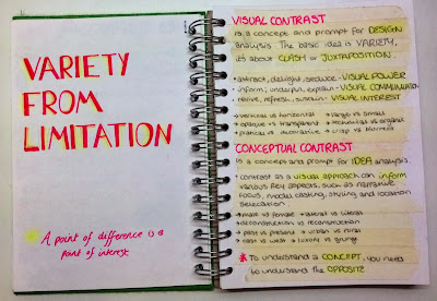
Visual Contrast

Visual Contrast


Photoshop: Editing Colour

Editing Colour Images

In today's tutorial we practiced and refined four ways in which we can manipulate images using colour. 

  • Luminosity
    • Create new Layer 
    • Place desired colour layer under original images
    • Change original image (top) layer behaviour to 'Luminosity'
    • Merge Layers and trim image where necessary
  • Hue and Saturation -
    • Image - Adjust - Hue (colour) and Saturation (strength)
    • Place desired colour next to image to improve accuracy
  • Halftone Pattern
    • (not available in CMYK mode, must be RGB) - image - mode - RGB - don't flat tern
    • make sure desired colour is in top layer of colour tool/palette
    • filter - filter gallery - sketch file - halftone pattern
  • Replace Colour
    • Image - adjust - replace colour
    • adjust fuzziness to determine how much of the colour you want 
    • use Hue/Saturation tools to further adjust

Tuesday, 15 October 2013

Colour Theory, Colour Selection and Colour Palettes


Colour Theory

Pigment Elements and Variants
Hue
This is the quality that we call the colour, to distinguish it from another.  HUE is the name of the colour e.g., blue, red, green
Value
This is the lightness or darkness of the colour
Chroma (chromatics)
This is the intensity of the colour, its brightness and purity, or dullness and impurity.
Tints
Hues with white added are called tints
Shades
Hues with black added are called tints
Tones
Hues with grey added are called tints

Colour Type

Primary Colours: Red/Blue/Yellow

Secondary Colours:  Blue-Green/Yellow-Green/Red-Purple/Blue-Purple/Yellow-Orange         -       /Red-Orange
                 
Tertiary Colours are obtained by mixing all three primaries of a primary with a secondary colour  for example: Orange + Blue/Green + Red/Purple + Yellow


Behaviour type

Harmonious Colours are those which lie next to each other on the colour wheel.  They sit easily together and graduate gently.

Contrasting Colours are those which lie far apart from each other on the colour wheel.  They sit uncomfortably together and clash against each other.

Complementary Colours are those which lie opposite each other on the colour wheel.  When
placed together each colour intensifies the other.  Adding a very small amount of
complementary colour to another subdues the intensity by dulling the colour domain.

Discordant Colours are created by reversing the natural order of colours e.g. red is naturally
darker than orange.  If white is added to create pink, then the pink becomes discordant with the
orange.

Colour Selection

Defining the particular use of colour in any project is important.  When starting from literally millions of options the process becomes initially one of reducing and editing towards a limited palette of colours.

These choices are based on many factors and are all based on the power of colour to deliver specific messages:-

Cultural - gender, age, politically, geographically etc.
Historical - era, association, provenance etc.
Social - life style, mood, attitude etc.

Working in any design discipline fashion graphics, interiors etc requires the skillful handling of colour.  A strip palette can help focus ideas, test feasibility and application theories.

1. Number and Selection
A selected colour palette means just that.  There is a limit of how many colours can exist in a legible combination.  As a result most palettes keep to between 2-10, 5 being a good starting point from which to add and subtract.

Apart from the obvious considerations of choosing colours to communicate your theme/story, it can be useful to deliberately try and incorporate different colours from different groups and avoiding choosing a monstrous range from a predictable category:-

- neutrals - fluorescent
- pastels - foil
- primary - pale tones
- secondary - deep tones

2. Sequence and relationship

Secondly the placement and alignment of the colours, which colour sit next to which colour ? No colour reads in isolation. Judge the colour when it is placed in the sequence , not on its own.Each neighbour’s effect on each other plays a vital part on how the strip reads.

2. Proportion and Composition

Thirdly, having chosen an initial range of colours, and their relationship to each other, consider the proportion of the colours, from the entire range of colours all  being equal to extremes of one colour being dominant other very minor. Remember that often the smallest volume of colour (the spot colour or accent colour) often has the biggest impact.

3. Flexibility and Range

Each palette needs to be considered not just as a combination of all the colours selected but looking at the choices in small groups, trios and parts.  By sub-dividing the range it is possible to demonstrate the full flexibility inherent in the selection to derive drastically different moods from one palette.

By involving the range of tones, tones and shades of each colour into the mix, you can also demonstrate how to further extend the range of colours/possibilities while still adhering to the carefully limited selection.

All this thought and analysis should provide a story and identifiable basis for selection.  Resulting in a colour palette that is:-

Communicative
- through use of colour/tone
- through use of relationship/placement
- through use of volume/proportion
- through use of editing/selecting

Flexible
- through consideration of number – 2 colour, 3 colour
- through consideration of tint – 100%, 50%, 10%
- through consideration of application – material, media, scale